This post shows the images I have taken from my Recce into what I want in my magazine. I have decided I want to use urban surroundings for my double page spread, and use a single block colour for my title page, as these are used conventionally in rock music magazines
This area would be good, as I could use a high-angle shot to get the whole group of models in the picture, but could present problems as it could be in use often, restricting the amount of time i would have to take the photo. There is also the possibility that one of my models could trip on a step. I would also have to photoshop the sign on the wall out of the image, or place my model in front of the sign, covering it from view.
While this area is a good width and is well lit, there are some problems with this area for an image. The first problem that is obvious is the amount of rubbish and debris in the area. This could present a hazard for the models, as they could trip on it.
This area could be used for an image, but the narrowness of the alley constricts how many people I could have in the image. This location could also be a problem as the floor is damp and has some moss, which could cause a model to fall over, but the wall on the left also looks like the paint is chipping off, which could cause problems if a model suffered from conditions like asthma.
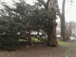
While this is not in the same sort of area as the other images, this location could be used for a double page spread, as natural locations are conventionally used. While this could be a good location for a large image there would be the obvious risks of low branches and roots coming out of the ground that models could either hit their head, or trip on. There would also be a problem if one of my models had hay fever, or something similar, as this could mean they would be unable to be in this location for long.


No comments:
Post a Comment